
 I noticed it and a few have told me about it. Viewing this website on a mobile phone presented a mish-mash of pictures and clustered entries that made navigation difficult.
The situation of mobile phone screens not displaying a website in an easy to read and navigate format is common. Many businesses and website owners don’t realize that mobile phones have overtaken PCs in their use of accessing the Internet. For all of these businesses it means losing potential customers and sales because people want websites viewed on their phone to be easy to navigate with information readily available.
The smaller screen size on a phone presents the problem, as does how the phone’s operating system reads website coding. Not everything is shrunk down equally (pictures may end up larger than the text, etc.). The phone tries to compensate by finding any available space to place the data and you end up scrolling endlessly, or having to expand a page at numerous places to read something.
Correcting it was a project I kept putting off because paying customers had to have their websites completed first. I finally found the time to get it done and I think most will be pleased.
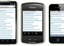
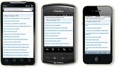
The mobile version of WestEastonPA.com should work with any mobile device. Android based or Iphone users, along with other mobile platforms, such as Blackberry phones should work correctly. I even coded specific phones such as Nokia and many others to display properly. Hopefully, I have the most popular phones set to work correctly. I’ll be happy with 98% of all phones seeing the site, as it was intended.
What will you see on your mobile phone?
WestEastonPA.com will display a long list of the more recent articles in title only, with links to the full article. Unlike the pc version of the website, mobile users will not be presented with the standard landing page of pictures and the sidebars format. An additional menu to pages and sub-pages will be found as you explore the site on your phone.
It’s clean and simple. It’s what mobile phone users expect and want.
UPDATE: 2/15/14
Regrettably I had to revert back to the old website being displayed on mobile phones. The mobile version was being picked up as the default website on many popular browsers being used on computers. Google Chrome is an example of a browser that would display the mobile version of the website, even though it was being viewed on a PC, or laptop.

After many complaints and an inability to get Chrome to play nice, I found it was just simpler to remove the mobile version, rather than to argue with all the different browsers that weren’t reading the website as they should.
Disclaimer: On January 4, 2016, the owner of WestEastonPA.com began serving on the West Easton Council following an election. Postings and all content found on this website are the opinions of Matthew A. Dees and may not necessarily represent the opinion of the governing body for The Borough of West Easton.


